
The purpose of data visualization and presentation is to deliver information and insights effectively. Adding axis titles to your Excel charts is an efficient approach. Axis titles provide context and clarity to the information presented on the chart’s axes, assisting users in interpreting the data. This article will walk you through adding axis titles to Excel charts.
How To Use Chart Elements Feature In Excel To Insert Axis Titles?
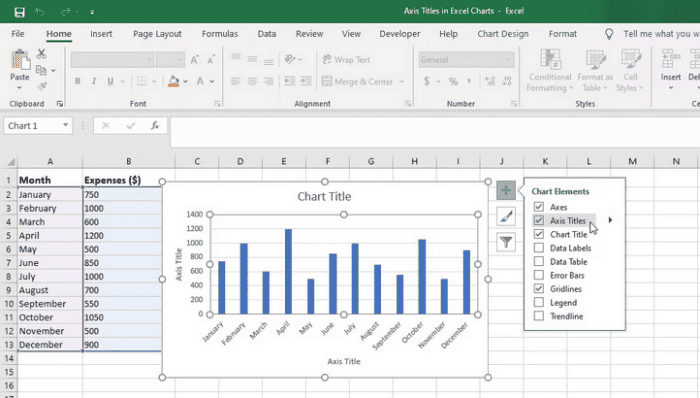
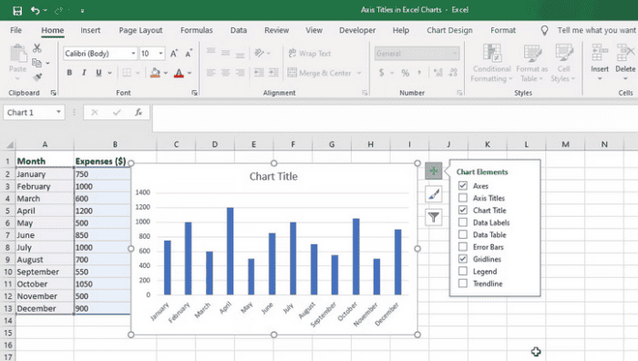
Excel’s Chart Elements tool enables you to customize numerous chart elements. Chart Elements allows you to reveal or conceal chart axes in Excel and add axis titles and other features. Here’s how to use Chart Elements to add axis titles to your Excel charts.
- In Excel, choose your chart.
- To open the Chart Elements menu, hover over the chart and click the plus (+) button in the upper-right corner.
- To add axis titles to your chart, tick the Axis Titles box in the display menu.
- To change the title, click on the “Edit Text” button.
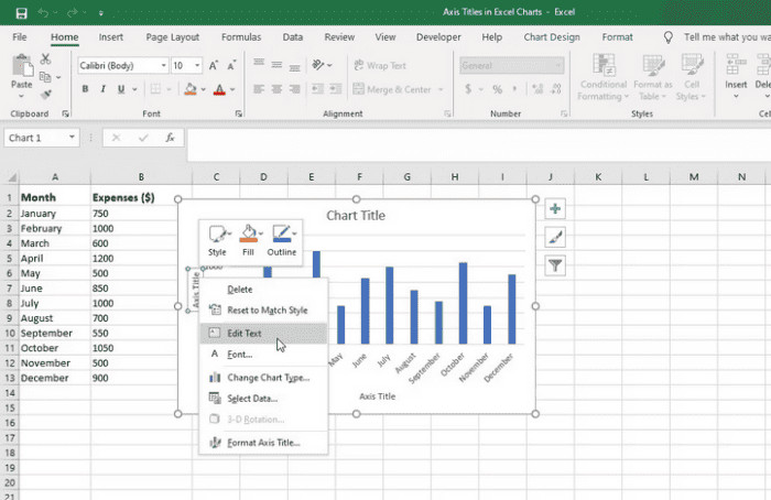
- To make the changes, enter the necessary text and hit Enter or click outside the title box.
How To Use Chart Design Tab To Insert Axis Titles In Excel?
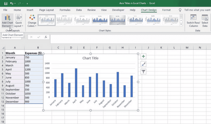
Another option for inserting axis titles in your charts is to use Excel’s Chart Design tab.
- In Excel, choose your chart to open the Chart Design tab.
- On the left side of the window, choose the Chart Design tab and then select the Add Chart Element option.
- Hover over the Axis Titles option in the resulting drop-down menu. A sub-menu of options will appear.
- Choose the Primary Horizontal or Primary Vertical option, depending on which axis you wish to add a title.
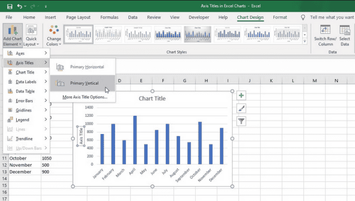
- Double-click within the title text box to modify the text.
How To Remove Axis Titles In Excel Charts?
Follow the instructions below to remove axis titles from Excel charts.
- By clicking the chart, you may choose it.
- On the right side of the chart, click the Chart Elements button. It resembles a plus symbol (+).
- Uncheck the Axis Titles box from the drop-down option that displays. The axis titles will be removed from the graphic.
Alternatively, remove an axis title by selecting it and using the Delete key on the keyboard. The specified axis title will be removed.
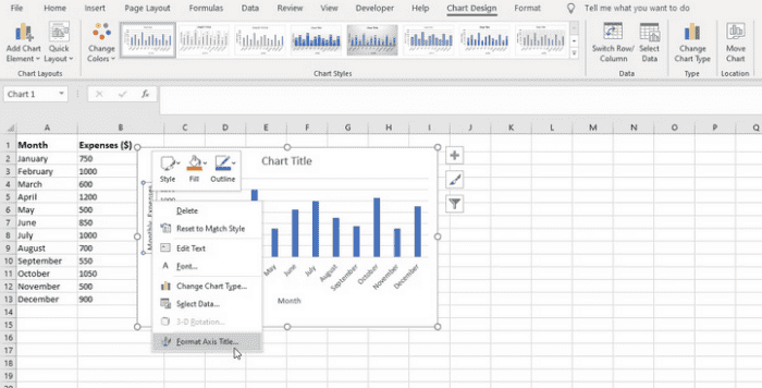
How To Format Axis Titles In Excel Charts?
After adding axis titles to your Excel chart, you may customize them to suit your desired style and presentation.
- By clicking the chart, you may choose it.
- Select Format Text Title from the context menu by right-clicking the axis title. Alternatively, select the title, go to the Format tab on the ribbon, and click the Format Selection button.
- A Format Axis Title pane will open on the right side of the Excel window. You may make formatting changes to the axis title here.
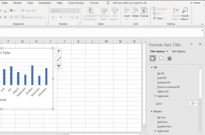
- You may modify the font size, color, alignment, text effects, and other formatting options in the window to suit your preferences. You can modify the fill color and add a border around the title if you like.
- As you adjust, the axis title will update in real time, enabling you to see the formatting.
- You may shut the Format Axis Title window or dialog box when you’re finished.
Also, Check:
Conclusion:
Axis titles are an important part of Excel charts since they increase the impact and efficacy of your data presentation. You can guarantee that your charts are aesthetically stunning and successfully communicate the desired message by adding clear and meaningful axis titles. To build aesthetically beautiful and useful charts, remember to experiment with various formatting options and explore extra chart modification capabilities.