
A logo contributes to the company’s success substantially. It is the visual representation of a brand that communicates the emotional significance of the company. It portrays the brand’s values, its story, and why it is so special to them.
In order to convey the right message to the customers, it is imperative that a brand strategically plans out the symbol or image that is supposed to be the embodiment of the true identity of the brand. It is a big responsibility on the part of the company that should serve the whole forethought behind its execution. Now, while there is a profusion of information that is supposed to be squeezed into a logo, it sure becomes challenging to ensure it all portrays well enough. Fortunately, some fundamental guiding principles can help you make a logo stand out from the rest.
Begin with Understanding your Target Audience
Before planning out a logo, you must comprehend your target audience properly. Until and unless you know who you are serving, you won’t be able to pull together the perfect blend of thoughts. So, begin with understanding your target audience and know what you exactly want to communicate.
First of all, look for the ideal customer for your company. Then, think about what do they value about your company? Are they looking for quality, responsiveness, or service? Find out if they associate trust and loyalty with your company. If you don’t know what your customer actually looks out in you, then ask them. It’s only when you understand your audience that you’ll be able to develop a relevant logo.
Another most vital factor that you must consider is what you want your logo to convey. Dig a little deeper and analyze the product or service that you intend to provide. Think about the cutting edge that you hold over your competitors. Fathom the core values of your company and incorporate them all into your company’s logo.
Now, after understanding the primary concepts, let’s dive into the 10 powerful elements that can make your logo stand out:
-
Simplicity

It might seem counterintuitive, but the most memorized logos are usually based upon the basic principle of simplicity. While everyone might have their own definition of simplicity, a logo must be easy to read and understand. When focusing on simplicity, it is easy to get off-track, especially when you’re getting better ideas in mind, but one should always stick to the fact that simple is better.
If you feel like complex logos portray professionalism or confidence, then let’s get that straight first. Complex logos only leave the audience confused. An adequately streamlined and straightforward logo remains memorable and will keep the audience engaged.
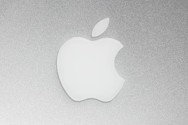
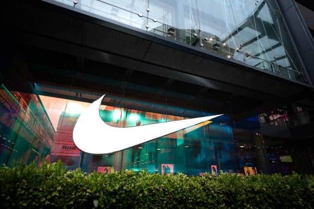
If that’s not convincing enough, let’s look at some of the most successful companies; Apple, Nike, McDonald’s. They all have their professional logo design, which is supremely simple yet captivating.
-
Relevance


A great logo or a cool design is obviously good and might be visually appealing, but if it doesn’t send out a clear message about what your company offers, it probably doesn’t hold much value. For a successful logo design, one needs to make sure that it is relevant. It must be targeted, purposeful, and must speak to your customers.
For example, choosing out a vibrant color just because it is your favorite one doesn’t support wisdom and logic. While choosing a color, you need to ask yourself the question of why you are going to use this color; what would it represent? You need to keep in mind that just because a certain thing appeals to you doesn’t mean it would appeal to your audience as well. So, think about what you want your audience to take home with them when they look at your logo.
-
Memorable

When we talk about your brand logo communicating your brand without the brand name, we do not mean that your logo must advocate what activity your business is involved in. Have you ever seen a car manufacturer place a picture of a car as its logo? You need to think around the fact that the consumer will only look at your logo for a few seconds. So, will those few seconds be enough to deliver your message to the consumer? Your logo is probably the first introduction of your brand to a potential customer, making sure what you construct makes a powerful statement.
At the same time, make sure that a too blatantly simple logo will also prevent the audience from feeling any personal equity with it. Therefore, while too much abstraction can be destructive, so can be excessive simplicity.
-
Flexibility
In order to make your professional logo design stand out, you need to design it in a way that makes it visible and distinguishable on a large billboard as well as a small business card. It must work well on various platforms, e.g., t-shirts, brochures, pens, or other marketing materials that are possible to hold your logo design.
You need to navigate through the thoughts that will it look good in many colors or just one. Will it work well in a black background or white background? Many start-ups or small companies use their logos on a few of the marketing materials and choose to use something else on the rest. So, make sure that your logo is flexible enough to suit all products.
When beginning with a start-up, you might be interested in the digital local trends and tips for increasing your business online, so check them out for optimal output.
-
Colors

Colors are critical when designing a professional logo, as they tend to send out a message to your customers. The color(s) you choose must strengthen the core value or personality that you’re willing to communicate to your target audience.
The color blue shows trust, loyalty, and freshness, mostly seen in the banking and finance industry. Yellow radiates happiness and enthusiasm, while red is usually associated with youth and excitement. After choosing the colors, you need to see if they will look good on a black or white background when printed. You need to make sure that whether it would render the same aesthetic appeal on all kinds of media as it does on your computer? If you are considering using more than 3 colors in your logo, think again because that would elevate your production cost.
-
Unique

Standing out among the crowd means to be unique in the competition. There are almond a million combinations of fonts and colors. So, choose one that keeps it distinguished from all of the rest. Try to think out of the box and elevate it without making it look low-budget.
-
Timeless

Moving along the trends is good; choosing a logo that is innovative and would resonate with the audience at all times would always be better. You don’t want to go with the fads, rather think about your design’s maximum life expectancy. Evolving it with time is okay, but the longer it stays the same, the longer recognition it will have. Think about Coca-Cola or Rolex. A logo with a sense of timelessness will always remain fresh and vibrant, no matter what the time.
-
Vectorized
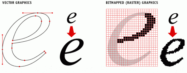

Always look for vector-based graphics. A complex logo design might look tempting, but it would not look good anywhere out of your online application. A vector design would complement the flexibility of your professional logo design in the best manner. It is going to define your standing in the competitive race as well as your values. Your logo is your first impression, so strive to make it good.
-
Quality typography
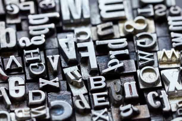
The typeface you use demonstrates a certain kind of dignity and power you want to communicate. Clean-looking typography would convey stability, so be critical about your choice. The larger the wording gets, the more visible are the flaws. Analyze the word spacing and the size of the letters to ensure if they would accommodate readability on small cards. Typography is not just a craft that you need to work with but the very first voice of stating your identity to the world.
-
Balanced


When choosing an icon, text, or graphic symbol, you must ensure that it reflects your company’s heart and soul. Keep the principles of proportion and symmetry in mind when designing the logo to give a strong and balanced look. The logo of Twitter revolves around the circle proportionality, which gives it a visually pleasing and balanced outlook. The same goes for the Apple logo.
Conclusion
Your business logo is the most important impression that you make on your potential customer. Therefore, you must make sure that you incorporate all of the elements mentioned above with utmost diligence. Good branding provides an amazing opportunity for small businesses to stand out in competitive branding. So, there’s no way that one wouldn’t want to make good use of it. Designing a logo is an adventure, but you need to ensure that it resonates with your audience and conveys a strong, powerful message.